Principle of Design: White Space
Organization/company name: Apple
Web site address: Apple.com
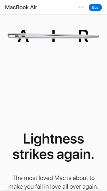
Apple is a perfect example for the White Space as element of Design. Not only they literally have decided to use white as their main color, they also use tons of negative space in their site. Overall the page looks clean, never crowded no matter where you click. Sometimes when browsing the internet from my phone, I get too many pop ups or too many colors and text offering the next new thing, but when I visit apple I get a sense of calmness and peace, the you only get with wise design and the magic of White Space. The headline and the text in this example are away from the MacBook Air, even the headline and the text have white space between them. This design makes it easier for the user to pay attention to one thing at a time and it's also easier for the text to be read, and to process it.
Principle of Design: Contrast
Organization/company name: WordPress
The web site address: WordPress.org
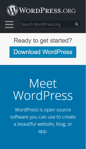
With WordPress even the logo is about contrast. The colors, the weight of the text, and then the logo and the text put together. Just in their homepage you can find contrast in the size of elements, color and text. The white of the background against the darkness of the header, then the white text against the blue background of the boxes of text are a great match put together. Then we go to the size of the text, that headline "Meet WordPress" must be at least double the size of the text below it. Contrast in size is good for moments like this one, where you can generate interest and give a call of action to the user to interact more with your site.
Principle of Design: Visual Hierarchy
Organization/company name: Squarespace
The web site address: Squarespace.com
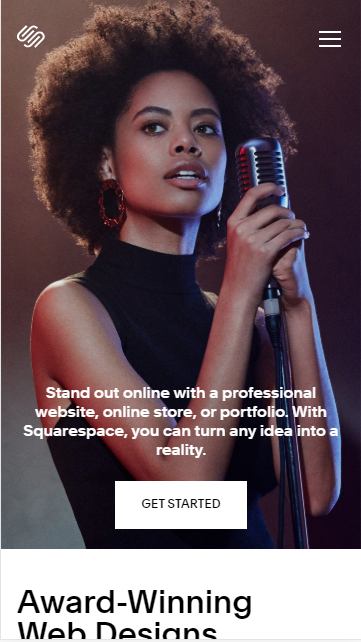
Squarespace is one of those websites that makes you have an internal "wow" moment. Their Visual Hierarchy game is on point. I don't know how they do it, but every time I visit the page they have super cool images and effects in their homepage. The purpose of this large photo is to grab attention and interest from the users. They also take advantage of the "Z pattern" (or the way we instinctively scan through a page). In this example, we start with the logo at the top left corner, then the hamburger menu to the top right, we see the gorgeous photo and the go down to an invitation or catchy phrase, then a button, to click and continue in the site. We can also see in here good use of the contrast, color, alignment and size properties